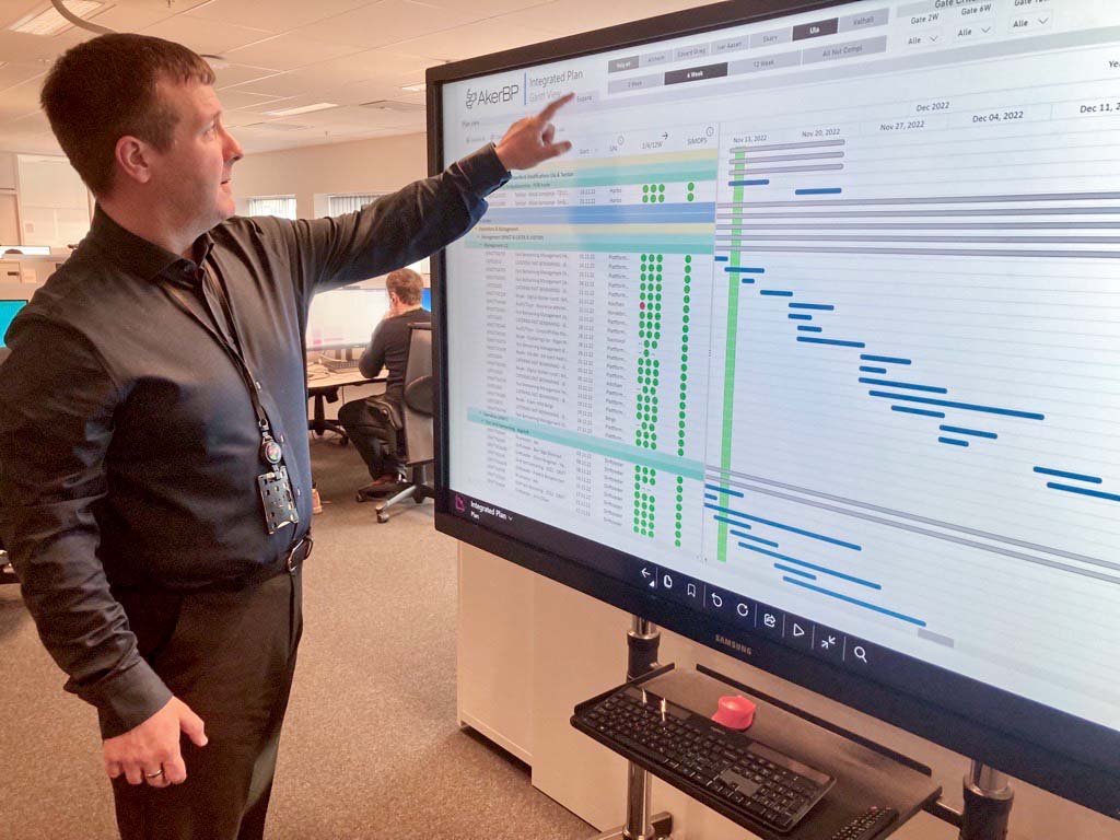
Profitbase sat down with Chris Westland, who works with Digital Excellence in Aker BP’s Integrated Planning function, to discuss our recent collaboration in developing the Power BI Gantt Visual app.
During a short period of collaboration, Aker BP was able to test the first beta version of the Gantt visualization.
“We heard that Profitbase was working on a Power BI visualization through our data and analytics team and saw the opportunity to get something we needed while also contributing to the development of the software. We were impressed with how quickly we were able to start the project and get something we could use,” says Chris.
Got more than expected in the first sprint
“Can you tell us a little more about the process and collaboration with Profitbase?”
“First, we discussed whether Profitbase could help us or not based on what we needed. We had a wish list of 15 different features, and ended up with 28,” says Chris.
“I think that in itself is proof of how well this collaboration actually went – we got more than we expected. We worked closely together through the various beta versions, until we arrived at the final version we use today,” he continues.
“The users have got a new solution to access plan data more directly, but in a lay-out they were used to seeing before. We’re using the big screen at the entrance to the planning department for visualization of the plans so everyone passing by can see it. We also use it to do testing and training for parts of the planning team.”
Good feedback
After Aker BP started using the new Gantt visualization, Chris reports that he has already received positive feedback from various users of the software.
“One maintenance manager offshore provided feedback that they found it great to test out the visualization in their weekly planning meeting and that it was incredibly useful to have a plan that was easy to understand and frequently updated. Additionally, they appreciated the ability to choose between two, six- or twelve-weeks’ overview and the ability to filter by different departments,” he says, adding:
“Having a single solution that all the data is fed into, instead of via several different systems, is also great because you get the same information no matter who and where. Everything is consistent.
In short, Gantt is a visualization that is used to view tasks along a timeline. This way of visualizing tasks is widely used in project management. In this way, you can see tasks and projects in relation to each other – which ones are happening simultaneously and which tasks depend on each other. You can use a Gantt chart on a highly detailed level, and plan hour by hour, or you can have a time horizon that spans several years, and everything in between. This makes Gantt a highly flexible and useful tool in project management but also for controlling a dynamic operational environment, such as offshore operations.”


