This article aims to tell why and how we built the Financial Reporting Matrix and how it “accidentally” grew into an international success. We hope it might be an interesting read about how a product can come to life, given the right opportunity, competency, and timing … sprinkled with a little bit of luck.
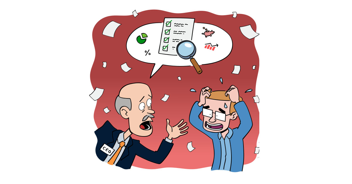
It all started in late 2018 when our Data Platform and Power BI consultancy teams faced challenges in delivering purposeful financial reporting to customers using Power BI. It was, and still is, impossible to create proficient financial reports and statements using only the built-in Power BI visuals. They pitched the idea of developing a custom visual for creating great financial statements to the software development team. Still, we had other priorities at the time, and the entire team was busy working on another product.
Given the low cost per user on the Power BI platform, our concern was customers’ willingness to pay for such a visual. Would we gain a return on investment? Another major concern was that Microsoft’s Power BI team could improve the built-in matrix or create a new visual for this purpose, leaving our work worthless overnight.
Power BI was, and still is, being rapidly developed, so if this feature were so important, we believed that Microsoft would address the issue rather quickly.
Based on all these uncertainties, we decided not to move forward with development at the time. The idea was not dismissed, though. During the next six months, it became evident that Microsoft was not prioritizing the issue. The Power BI consulting team kept bringing the idea up as it prevented them from delivering the best possible services to their customers.
A few members of the software development team started investigating what effort it would take to develop an MVP (minimum viable product) that would include the features that the Power BI consulting team was looking for. At Profitbase, we developed and sold our own reporting tool for years, so we had extensive experience building these types of table/matrix visualizations for financial reporting.
We also had a calculation framework from a different product that would enable users to write custom formulas using a familiar Excel-like syntax instead of DAX. We didn’t, however, have any experience with the Power BI platform or developing Power BI custom visuals, so the Power BI programming model was new to us. In the end, our guesstimate was that it would take about 1.5 months to develop the first version, allocating only a single developer full-time for the job.
Because it required so little effort and was a tool that was needed internally, we decided to go ahead. We were still uncertain whether the visual would be profitable as a standalone product, but we figured it could function as a marketing tool to draw attention to our other products and services since this feature was clearly lacking from Power BI. Hence, others were most likely facing similar challenges.
We debated whether to make the visual free or paid and ended up initially making it free for the following main reasons:
The first version was completed within two months, primarily by a single developer, with some assistance from the Power BI consulting team for creating sample data and testing. The visual was available on AppSource a few months later and received a very warm welcome from the Power BI community. We created a YouTube video demonstrating the features, and people were highly enthusiastic in their comments – including one claiming the solution was “f**king amazing.” Therefore, YouTube started requiring age verification to watch the video … we thought it was pretty funny 🙂
We used GitHub to talk to our users, and it proved to be a supportive and great communication tool. We chose Github because it is freely available to anyone, has issue tracking/discussion boards, a wiki (for documentation), release management (downloads) and an API which lets us automate things.
We started developing version 2 because of the significant uptake and enthusiastic welcoming the visual received from the community, combined with great feature requests coming in. It was completed in January 2020 and made available from GitHub only. We never released it to AppSource because we experimented with features that might be breaking in the next planned version, so we didn’t want to put it on AppSource, where everyone would get it automatically.
The visual kept getting a great deal of attention from the community, but we didn’t immediately start planning version 3 because we were busy doing other things. Then, in February 2020, one of the world’s largest consulting firms contacted us. They were building a platform based on Power BI but could not provide smart financial reports that satisfied their high standards. Our visual was the closest they had to finding something that solved their problem, but some essential features were missing, so they reached out to see if we were open to get these features added to the visual.
We jumped on the opportunity to get the visual incorporated into the organization of such a big player. After some quick online meetings to better understand their needs, the people in charge of the project flew in for a two-day workshop so we could get to know each other and iron out the details. It was important to us that, even though they had specific needs, the features that were added to the visual had to be applicable to others as well.

At Profitbase, we’re also experts in juggling life and work to deliver solutions.
During the workshop, we agreed on the features as well as the financial terms of the deal. This marked a turning point for the visual. Until then, the visual had been a side project for us where we occasionally allocated some resources to development and pushed out new releases. We had now entered into an agreement, which meant that our primary customer switched from internal to external and the visual changed from an experiment to a supported product.
After the talks with “Big Corp” and looking at the features we were going to add, we realized that we should monetize on the visual. The features we were adding were a part of the deal with “Big Corp,” so giving them away for free to other customers was not an option. It also became clear that there were no other visuals that matched our product’s capabilities. Most of these new features went into a paid Premium tier.
Our philosophy when deciding whether a feature should go in the free or Premium tier is that our customers should be able to create excellent financial statements using only the free features.
“We believe that the free features should cover 100% of the must-have requirements for 80% of the customers.”
The Premium tier’s features are for advanced scenarios or features that accelerate the development of financial reports in Power BI. In addition, running the visual within any embedded environment requires a Premium license. The reasoning behind this is that embedding usually means some kind of product running on top of Power BI, and it’s only fair that we should receive suitable compensation if our visual is an enabler for a paid product. Developers also benefit because they purchase both support and the assurance that the visual is developed and maintained by us.
Turning the visual into an officially supported product also meant that we needed to scale up the development and do it quickly. All our developers were committed to our low-code platform, which underpins our Enterprise Performance Management (EPM) suite of products, and they could not be reallocated. We decided to outsource most of the visual’s development to one of our partners, whom we knew well and trusted. We had already released two versions, so the software infrastructure and architecture were already well established. With our guidance, the outsourcing partner quickly picked up on our codebase and started implementing new features. The partner worked remotely, so we organized the project in the following manner:
Financial data is highly sensitive information. Software systems contain many components, and third-party libraries are one of them. We are responsible for ensuring that we don’t introduce security vulnerabilities through the use of third-party libraries, and for “Big Corp,” the situation was the same. Their platform handles highly sensitive information, and their customers trust them to keep everything secure. Any data leakage can have severe consequences. The visual is now officially Microsoft-certified, but this was not the case at the time. We granted them access to the source code to make their own security assessment of the visual, which resulted in a green light, and no vulnerabilities were found.
Keeping the visual secure is a high priority for us. We try to keep the use of third-party libraries to a minimum, and the libraries we use are well-known industry-standard libraries. These libraries continually undergo security assessments and are updated if any vulnerabilities are found. To be transparent, we keep a list of all the visual’s third-party libraries available in our security document on the GitHub Wiki. Additionally, the process of getting the visual certified by Microsoft has its own set of security requirements, so the visual goes through multiple layers of security checks before it reaches customers.
Before we could ship a paid version, we had to get an online payment solution up and running. The payment service we chose had support for all our requirements such as a customer portal, different subscription plans, automatic renewal of subscriptions, and automation API, therefore it could easily be integrated into our website.
Version 3 had many new features, and when it was released to AppSource, we noticed an even greater uptake by companies worldwide. Since then, we have continued to use the same processes for development and releasing new versions because they are successful. We use GitHub as our primary communication channel with the community, while customers on Premium plans receive direct support through email or interactive meetings. Because of Power BI’s global reach, we work with many exciting companies worldwide, operating in various industries. This has been rewarding to us as we can provide guidance and gain new knowledge.
Going forward, the primary focus for us now is continued development and marketing. We have a long list of features we would like to add, but we need to balance things, so the visual does not get complicated to use.
Up until now, we have not been marketing the visual extensively. Usage has been steadily rising due to the availability on AppSource and most likely because people are Googling ways to get financial reporting right using Power BI. With every release, we have made feature videos and published them on YouTube. Obviously, this is not enough, so producing more documentation and demos is a high priority for us. We will also focus on marketing on different platforms.
We hope we’ve given you exciting insights into how the Financial Reporting Matrix went from initially not being considered viable to becoming a successful product with a global reach. It seems we were lucky enough that a few critical ingredients for success were in place at the right time; There was a clear demand for a solution to address an important issue, namely the lack of proficient financial reporting in Power BI. Secondly, we had a large audience because of the global reach of Power BI. Thirdly, we encountered a Blue Ocean scenario because there were not many other players on the field. Finally, we had the knowledge to make it happen because we had extensive experience building these tools.